Graphic Wall Clings for Slatwalls at Retail Store
One of the most aesthetically outdated fixtures in a retail store are the slat walls used for displaying products. Owners of small, privately-owned retail stores spend a lot of money designing their interiors to compliment their brand, but then are stuck with less-than-beautiful faux wood display racks on their walls. There really are not many affordable alternatives out there, are there? Well, here is an easy and inexpensive way to make your product walls look great and add pop to your showroom!
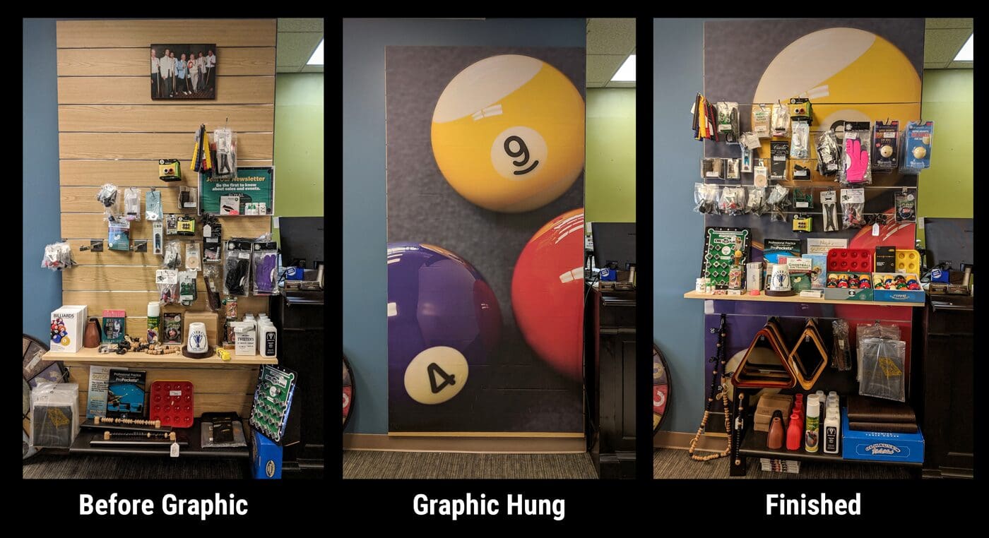
This is a project we did for Royal Billiard & Recreation, a retail store in Hatfield, PA that sells game room products.
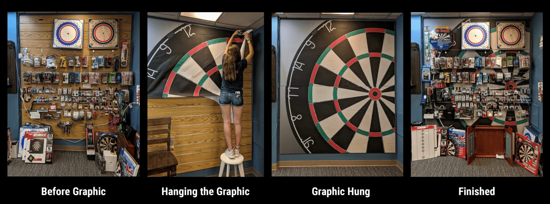
To update these walls with striking graphics, we visited Royal Billiard & Recreation’s showroom. There the owner, Audra Delconte, and our lead, Josh, worked together to come up with concepts for the two walls. Once the concepts were decided, compositions were created with the pool balls and dartboard that would fit in the proper ratio of the two slat panels and the setups were photographed. Creating the compositions is an extremely important step and takes the experienced eye of a designer. Consider this: the walls are odd shapes and the arrangements, especially the pool balls, have to be created in a manner that will fit the wall properly once cropped to the proper shape.
The process of photographing the products includes using proper lighting (strobes) and a high megapixel camera. There are several reasons why light is added:
- Allows the camera to shoot at a lower ISO, creating a sharper, less grainy image.
- Creates dimension and separation of the products by controlling highlights and shadows.
- Makes the colors more vibrant and gives the image more “pop”.
And simply put, a high megapixel camera allows for greater clarity on these large prints.
Once the setups where photographed, Josh edited the photos to further increase the clarity, colors and presentation. In this case, he had to remove text from and clean up some of the blotches on the dartboard, and lessen the texture of the pool table cloth under the balls. This helped for the images to appear more graphical and less pictorial.
Ordering the graphics was a bit tricky. These are big walls! For the pool ball wall, I was able to order one custom sheet by turning the graphic sideways before uploading. However, the dartboard graphic had to be cut in half (digitally) and printed on two separate sheets. Quite frankly, that worked better overall because hanging the large dartboard graphic as one sheet would have been very difficult.
Hanging the walls was a lot of fun, actually. We find something about smoothing out the vinyl and stepping back to appreciate the changed wall very pleasing. The process is pretty straight forward. The graphic comes with a peel away back. Simply start at one corner and work your way across and down. Josh found it’s easiest to start the smoothing process with your hand, but to have a small squeegee available to get out the tougher bubbles and creases. At any point, you can always pull back the graphic from the wall and restart a section; it’s low-tack. Just be careful not to crease the graphic, as that will leave a white line.
Once the graphic is hung, all that is left to do is cut the slats so you can remount your product shelves and rods. Be sure to have a few razor blades handy as they do dull quickly! It is our recommendation to only cut the rows of slats that you will be hanging product on to allow for a complete image above (or below).
And that’s all you need to do to update your showroom with some great graphics! If you have any questions, please feel free to reach out.
Contact pixelMIGHT
215-230-7300
team@pixelMIGHT.com

